Showing posts with label design. Show all posts
Showing posts with label design. Show all posts
Wednesday, April 12, 2017
Never Ride Stock
I heard James Victore say this and loved the phrase. Basically, he's saying to be original, be unique and don't use stuff out of the box — make it yours! Decided to create this quick little composition, inspired by Victore. Graphite, ink, acrylic paint on chipboard.
Labels: illustration
5 minute illustration,
custom,
design,
hand letter,
hand lettered,
james victore,
lettered,
never ride stock,
ryon edwards
Tuesday, August 30, 2016
Deadlines Looming / Looming Deadlines
It’s 7:30 pm. I'm at work. Deadline quickly approaching. I'm running out of steam, so I made this little illustration.
Labels: illustration
artwork,
azo sans,
deadlines,
deadlines looming,
design,
editorial,
hourglass,
illustration,
looming deadlines,
out of time,
playful,
ryon edwards,
sans serif,
sout hcarolina,
working too late
Monday, September 29, 2014
Hi-fidelity Stereophonic Design
When I visit my local Goodwill, I usually head straight to the vinyl records section. I just gotta know what obscure album might be there or if today is the day I find that one album I’ve always been looking for. I’m also on the lookout for great design. Every once in a while I come across a cover design so strong, that it just stops me in my tracks. That’s how I discovered my first Command Records album.
Command produced records in the late ’50s to mid-’60s and were produced and engineered by Enoch Light, a pioneer in stereo recordings during a time when AM (monaural) radio was the standard. Many of the covers were designed by well-known artists/designers like Josef Albers and Paul Bacon. Josef Albers! These abstract, minimalist covers stood apart from the typical covers of the time and beautifully captured the essence of the music through expressive design and well-crafted compositions. The covers gave the listener an idea of what to expect — a crisp, modern, stereo sound that’s harmonious, but with a sense of playfulness. Most of the Command Records covers incorporated classic design principles brilliantly: balance, proportion, rhythm, emphasis and unity in a modern style that still looks fresh today.
Labels: illustration
command records,
design,
enoch light,
graphic design,
h-fidelity,
josef albers,
mid-century,
paul bacon,
vinyl,
vinyl records
Tuesday, July 17, 2012
New design for Goodwill Industries of Upstate/Midlands South Carolina
Labels: illustration
advertising,
cool,
design,
fan,
goodwill,
Goodwill Industries of Upstate/Midlands South Carolina,
illustration,
marketing,
original,
outdoor,
retro,
riggs partners,
ryon edwards,
thrift
Tuesday, April 10, 2012
The Golden Ratio: where design and mathematics coincide
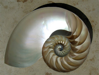
The golden ratio (also known as the golden mean, golden section or divine proportion) is a height to width ratio that measures 0.618 and manifests itself in nature, art and architecture. The Parthenon in Greece incorporates the ratio, but it’s unknown whether or not the designers actually used the principle. The human form has this same basic geometric relationship — DaVinci studied this and created drawings that illustrated the proportion in his Vitruvian Man (below). Piet Mondrian used the golden ratio in much of his work in the 1920′s. Even Twitter uses the golden ratio principle for it’s screen design.
The Golden Ratio looks like this:
It's defined as the ratio between two segments such that the smaller (bc) segment is to the larger segment (ab) is to the sum of the two segments (ac), or bc/ab = ab/ac = 0.618.
And can be calculated like this (adding 1 to the ratio is phi, yielding the same basic geometric relationship):
More examples of the Golden Ratio:
Fascinating! Is it an inherent aesthetic preference or is it a design technique turned tradition? How do you explain the proportion found in nature? However you decide to answer those questions, it’s hard to argue that it has had an enormous impact on art and design over the years and continues to influence design today. Next time you see something that just “feels” right, or that you just can’t take your eyes off of, take a look at the proportions and remember – Ahh, it must be the 0.618!
- Ryon
Labels: illustration
columbia,
design,
golden ratio,
graphic design,
riggs partners,
ryon edwards,
south carolina
Subscribe to:
Posts (Atom)


