You know about the Flat Out Strangers, right? Well, if not, that's OK. They're the South's most dangerous, mysterious, yet most-revered rockabilly/country/americana/bluegrass bands around. Don't just take my word for it - listen at
www.myspace.com/flatoutstrangers or visit their new site at
www.flatoutstrangers.com. It's great to see these guys doing well — I remember the neighborhood gigs that scared the living daylights out of the neighbors, the live and rockin' recording at "Jake's Fill Er Up" (which proved to the world that they are the bada**es of Rockabilly), to the shows at Doc's Gumbo Grill and many others. These guys are original as they come, and they needed a design that reflected that. Something mysterious, something bold, yet timeless. Tall order, but a great challenge. Here's where I started:
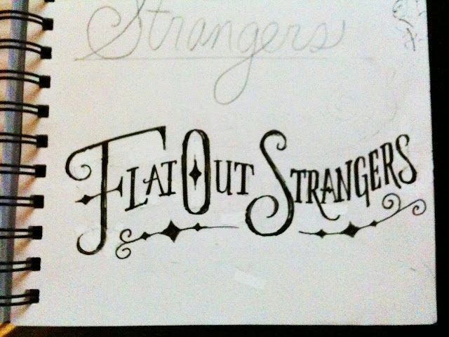
A rough sketch below: Letterforms that have character - something that looked from the late 1800's, but with a modern twist. Hand-drawn and hand-crafted. A few embellishments here and there, but not too ornamental or too decorative. A touch of the Old West, a hint of the eclectic, a good dose of authenticity.
Refinement on the letterforms and the individual swashes:
And the final:
And an avatar/monogram design:
Check ’em out at their next show or become a fan on Facebook:


4 comments:
wow...i have a lot to learn about typography. Beautiful work from start to finish. It's nice to hear the ideas behind what your were thinking with the type too
Thanks Kevin!
We, the Flat Out Strangers, are absolutely on fire with the logo that Ryon created. Some logos speak to what an entity is about.
Just occasionally a great logo comes along and speaks to both what an entity is about and to what it aspires to become. This is such a logo - and it absolutely beautiful to boot.
That is gorgeous! I was hoping that was a font that could be purchased!
Post a Comment