

Thursday, March 10, 2011
Clean lines and color
Art Metal Co. Office chair. ca. 1970? Original upholstery and vinyl piping. I need to do a little more research into this chair and the manufacturer.
 The comfort level has been debatable around the office. The place of I found it also has been somewhat controversial. But I like it. Clean lines, nice geometry, great color and not that uncomfortable!


Monday, February 7, 2011

Monday, January 3, 2011
1966 Olympia DeLuxe Typewriter
My latest obsession: old typewriters. Specifically, this 1966 Olympia DeLuxe manual typewriter in MINT condition. This beautiful example of German engineering is evident in every keystroke, in every mechanical movement and in every sound that you hear when the metal script letters strike the paper and the roller beneath. Bonus: this typewriter is portable and requires no electricity. The script type that this machine renders is exquisite, especially when examined closely. Which makes me think that a revival of this Olympia DeLuxe Script could be an exciting type project in the very near future. Stay tuned and keep typing!


Monday, October 4, 2010
Flat Out Strangers Logo
You know about the Flat Out Strangers, right? Well, if not, that's OK. They're the South's most dangerous, mysterious, yet most-revered rockabilly/country/americana/bluegrass bands around. Don't just take my word for it - listen at www.myspace.com/flatoutstrangers or visit their new site at www.flatoutstrangers.com. It's great to see these guys doing well — I remember the neighborhood gigs that scared the living daylights out of the neighbors, the live and rockin' recording at "Jake's Fill Er Up" (which proved to the world that they are the bada**es of Rockabilly), to the shows at Doc's Gumbo Grill and many others. These guys are original as they come, and they needed a design that reflected that. Something mysterious, something bold, yet timeless. Tall order, but a great challenge. Here's where I started:
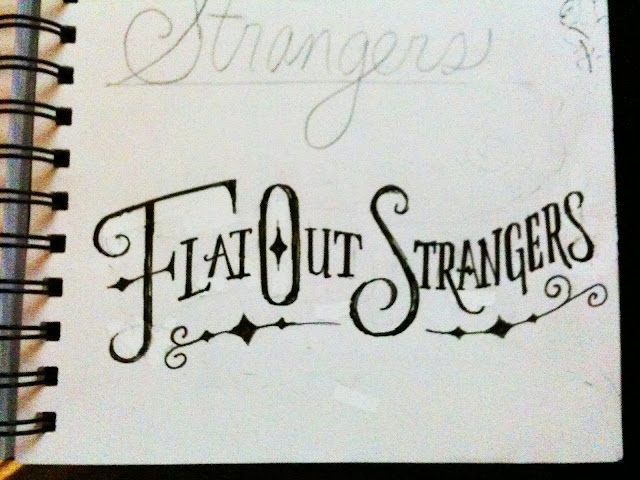


A rough sketch below: Letterforms that have character - something that looked from the late 1800's, but with a modern twist. Hand-drawn and hand-crafted. A few embellishments here and there, but not too ornamental or too decorative. A touch of the Old West, a hint of the eclectic, a good dose of authenticity.

Refinement on the letterforms and the individual swashes:

And the final:

And an avatar/monogram design:

Check ’em out at their next show or become a fan on Facebook:
Friday, August 27, 2010
Friday, July 23, 2010
"Double"

A little illustration I did for Illustration Friday (a weekly illustration challenge), based on the single word "double". This double used to be a triple. Be happy with a double. Don't be greedy.
Tuesday, June 22, 2010
Creatures Observed - Backyard 6/21/10

I couldn't get a good shot of the chicks, so I decided to do a quick sketch instead.
Update: As of June 27, the chicks are not in nest. Hopefully, they have flown the coop successfully. After some research, I've found that these birds love to eat bees and wasps! After they shred the stingers off, of course.

Tanager nest - three chicks spotted in nest yesterday. Hopefully more photos to come.

Male Tanager checking out the activity surrounding the nest.

Female Tanager tending the nest. She's a beautiful yellow-green.

I'm outta here!

Common box turtle that visited, but that had no patience for my observation.

Red daylily

Reddish Stag Beetle: This guy was cool - and surprisingly pretty mellow. I'm happy that the image shows off the color and texture of the exterior shell.

OK, not looking that mellow here.
Subscribe to:
Posts (Atom)