

Showing posts with label typography. Show all posts
Showing posts with label typography. Show all posts
Sunday, March 9, 2014
Disorders of Typography Poster
While waiting in the examination room at my eye doctor, I noticed the archetypal medical poster on the wall depicting normal and abnormal conditions of the eye, complete with cutaway illustrations of eyeballs and eyeball parts, with precise labeling and detailed information. This inspired me to create my own poster — but for type-geeks and non-type-geeks alike.


Thursday, February 7, 2013

Wednesday, January 30, 2013

Tuesday, June 5, 2012

Wednesday, April 4, 2012
Library of Congress and Bill of Rights detail
I found this beautiful version of the Bill of Rights on the Library of Congress site, which has an amazing collection of images: A Bill of Rights as provided in the Ten Original Amendments to The Constitution of the United States in force December 15, 1791. http://www.loc.gov http://1.usa.gov/Ha5LQY


Monday, January 16, 2012
Type Observed: Hobo
I see the typeface “Hobo” in a lot of different places — labels, signs, posters, logos – the list goes on. I once thought that this was one of the ugliest type designs out there, but I now realize that it’s not the design itself, or even the terrible name — it’s mostly because of how it’s used and misused. Of all the type crimes out there (thank you Ellen Lupton: http://www.thinkingwithtype.com/contents/extras/#Type_Crimes), you’ll often find Hobo as a nearby accomplice. And I’ve certainly made my jokes about this “awful” typeface over the years, but once I studied the origin and the history of this design, I’ve become much less critical.
Stylistically, Hobo looks like something crafted from 1970′s, but was actually designed in 1910 towards the end of the Art Noveau Movement. It was designed by Morris Fuller Benton, one of America’s most prolific typeface designers. After closer examination, the letters are actually well-proportioned (when typeset properly) — every part of each letter is curved, which gives it a decorative effect, but with a modern twist. It’s lowercase letters are unique — descenders that do not drop below the baseline. Yeah, it’s weird — but it’s designed to be a display type. Fairly progressive for 1910, considering that most typography from that period was very decorative and ornate.
So I’m no longer a Hobo-hater. I just hate seeing it being misused.
Note: If you’ve seen examples of Hobo type out there (good or bad), please send some pics my way – I’m starting a collection of images and would love to include yours! Thanks.


Stylistically, Hobo looks like something crafted from 1970′s, but was actually designed in 1910 towards the end of the Art Noveau Movement. It was designed by Morris Fuller Benton, one of America’s most prolific typeface designers. After closer examination, the letters are actually well-proportioned (when typeset properly) — every part of each letter is curved, which gives it a decorative effect, but with a modern twist. It’s lowercase letters are unique — descenders that do not drop below the baseline. Yeah, it’s weird — but it’s designed to be a display type. Fairly progressive for 1910, considering that most typography from that period was very decorative and ornate.
So I’m no longer a Hobo-hater. I just hate seeing it being misused.
Note: If you’ve seen examples of Hobo type out there (good or bad), please send some pics my way – I’m starting a collection of images and would love to include yours! Thanks.


Monday, October 4, 2010
Flat Out Strangers Logo
You know about the Flat Out Strangers, right? Well, if not, that's OK. They're the South's most dangerous, mysterious, yet most-revered rockabilly/country/americana/bluegrass bands around. Don't just take my word for it - listen at www.myspace.com/flatoutstrangers or visit their new site at www.flatoutstrangers.com. It's great to see these guys doing well — I remember the neighborhood gigs that scared the living daylights out of the neighbors, the live and rockin' recording at "Jake's Fill Er Up" (which proved to the world that they are the bada**es of Rockabilly), to the shows at Doc's Gumbo Grill and many others. These guys are original as they come, and they needed a design that reflected that. Something mysterious, something bold, yet timeless. Tall order, but a great challenge. Here's where I started:
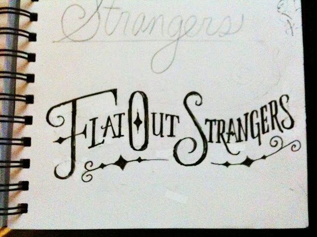


A rough sketch below: Letterforms that have character - something that looked from the late 1800's, but with a modern twist. Hand-drawn and hand-crafted. A few embellishments here and there, but not too ornamental or too decorative. A touch of the Old West, a hint of the eclectic, a good dose of authenticity.

Refinement on the letterforms and the individual swashes:

And the final:

And an avatar/monogram design:

Check ’em out at their next show or become a fan on Facebook:
Monday, April 19, 2010
if…


Sometimes things appear in the most unexpected places. If this had been more obvious, it would have jumped out of the water and bit me. Which is something that crossed my mind while paddling down the calm Cedar Creek in the Congaree National Park/Swamp. We saw 300-year old bald cypress trees and tupelos, dragonflys, fishing spiders, jumping fish, and numerous snakes. Will and I paddled a little too close to a brown water snake that was hanging out on a branch above. A little too close for me, but we gently cruised on by and all was well.
But seeing this word appearing out of the water is what made the trip even better. A slanted lower case “i” (complete with the dot) and a perfectly positioned upper case “F”. Perfect. And living there in perfect harmony in nature as if it were asking us to complete the sentence. iF ...
Maybe you had to be there, but for me, it was fantastic. I've been trying to complete the sentence ever since.
Thanks to Jeff McGurk for the shot for me (and for organizing the trip). Let's go back soon and see what else we can discover.
Thursday, July 23, 2009
What was this guy smokin?

I love signs — they inform us, direct us, alert us, and many times simply entertain us, as in this case. I shot this several years ago and came across the image recently. It's always been one of my favorites, primarily because of the story behind it.
After I talked to the owner about this sign, he acknowledged the misspelling and told me that they sent the sign painter back to redo the sign because the first sign that was delivered was spelled “NO SMOKIN” (which generally would fly here in the South). He explained to the sign painter that it needed a G on the end to be correct. So the painter went back to his shop and delivered a brand new sign, with a great-looking G on the end, with even better letterspacing than before. Unfortunately, not enough attention paid to the entire word. Which leaves me to wonder how many times do we become so focused or worried on solving a small issue or problem, and still end up missing the big picture?
Subscribe to:
Posts (Atom)