Friday, August 25, 2023

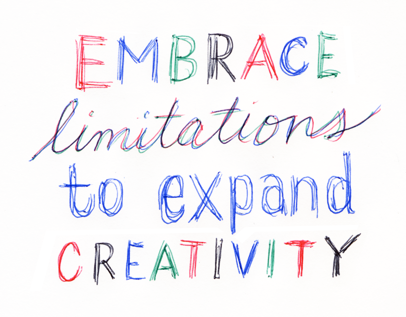
Embrace Creativity

Heard someone say this recently and it struck a chord with me — so I sketched it out so that I would remember it. Drawn with my favorite BIC 4-color Retractable Ballpoint


Thursday, January 9, 2020

Bequia Threadworks Brand Identity Design

Bequia Threadworks is a nonprofit sewing enterprise that empowers and trains the women of Bequia as artisan seamstresses. Working to spark economic transformation for Bequian families, the clothing line and identity are affirmation of the island’s craftsman history.

Teal was chosen for the logo color, inspired by the water in the Caribbean. A custom monoline script was created to reinforce authenticity and craftsmanship. Custom buttons with the B letterform were made to be used on the clothing line.


Thursday, July 13, 2017

Les Flat Out Strangers Logo Design


Had a lot of fun creating this original, custom logotype for one of the coolest bands in Columbia, SC. Django Reinhardt's mustache inspired the flourishes surrounding the descender of the G. Hot Jazz lives on.

Wednesday, April 12, 2017

Never Ride Stock


I heard James Victore say this and loved the phrase. Basically, he's saying to be original, be unique and don't use stuff out of the box — make it yours! Decided to create this quick little composition, inspired by Victore. Graphite, ink, acrylic paint on chipboard.

Tuesday, August 30, 2016

Monday, April 13, 2015

Fungi Photos

Beauty can be found in unexpected places, even in the form of something (mostly) unappreciated. I was fascinated with the variety of color, texture and contrast against the background. I am not sure of any of the varieties or species.


Tuesday, March 17, 2015

Art Studio/Small cabin sketch

Sketch #1: Idea for my small cabin/studio down in the woods. Reclaimed tin roof and wood. Would be 8' x 8' studio with a 8' x 8' deck. This is a fairly conservative design — I may try something more unique with some found materials.

Monday, September 29, 2014

Hi-fidelity Stereophonic Design

When I visit my local Goodwill, I usually head straight to the vinyl records section. I just gotta know what obscure album might be there or if today is the day I find that one album I’ve always been looking for. I’m also on the lookout for great design. Every once in a while I come across a cover design so strong, that it just stops me in my tracks. That’s how I discovered my first Command Records album.

Command produced records in the late ’50s to mid-’60s and were produced and engineered by Enoch Light, a pioneer in stereo recordings during a time when AM (monaural) radio was the standard. Many of the covers were designed by well-known artists/designers like Josef Albers and Paul Bacon. Josef Albers! These abstract, minimalist covers stood apart from the typical covers of the time and beautifully captured the essence of the music through expressive design and well-crafted compositions. The covers gave the listener an idea of what to expect — a crisp, modern, stereo sound that’s harmonious, but with a sense of playfulness. Most of the Command Records covers incorporated classic design principles brilliantly: balance, proportion, rhythm, emphasis and unity in a modern style that still looks fresh today.

What a great example of form and content working well together. Stereophonic design, indeed.


Sunday, March 9, 2014

Disorders of Typography Poster

While waiting in the examination room at my eye doctor, I noticed the archetypal medical poster on the wall depicting normal and abnormal conditions of the eye, complete with cutaway illustrations of eyeballs and eyeball parts, with precise labeling and detailed information. This inspired me to create my own poster — but for type-geeks and non-type-geeks alike.