Monday, August 22, 2011
Sears 5-speed Restoration
Update: Restoration is on! Stripped down to frame, cleaned, polished in every nook and crevice. New wheels, new tubes, tires, cables, brake pads, grips, derailluer, etc, etc. Keeping it classic and keeping the chrome.
Labels: illustration
1960's,
Austria,
bike,
Germany,
PUCH,
restoration,
ryon edwards,
sears vintage
Monday, August 8, 2011
Thursday, July 28, 2011
Protect Antarctica Poster
Poster I designed to support scientific research and preservation of Antarctica and its habitat. Specifically for Dean Schuster of www.truematter.com, who is running a marathon in Antarctica for the cause: Check it out at http://runningwithpenguins.com/
Labels: illustration
antarctica,
dean schuster,
riggs partners,
running with penguins,
ryon edwards,
south carolina,
truematter
Wednesday, June 1, 2011
Project Bike - Sears 5-speed
My latest project bike — I love the classic styling and modern graphics on this bike. Bonus that it's green and it's made in Austria (probably by Puch). Trying to decide whether this should be a Fixie conversion or a restore to original? These pictures don't illustrate how much work this bike will need.
After five months of on-and-off work, lots of elbow grease and finding just the right parts, it's complete!
The restored 5-speed below:
New wheelset, tires, tubes, derauiller (Simplex), new vintage styled seat, recycled cork/rubber grips, new left brake lever, brake pads and all cables. Ready to hit the street!
Labels: illustration
5-speed,
Austria,
bike,
restoration,
ryon edwards,
sears vintage,
south carolina
Wednesday, May 18, 2011
“Amper-what?”: the origin of a symbol
For a recent naming assignment we were working on, the “@” symbol and the “&” symbol came up in conversation. I’ve always loved the typographic character of the “and” symbol, known as the ampersand. The symbol is one of the oldest alphabetic abbreviations and dates back to Roman times. It evolved from the Latin word et, which means and. If you’ve ever noticed elaborate (italic) styles of ampersands, the Et letterforms are quite visible in the design. Ampersands were traditionally used for display (larger) work, as opposed to smaller, longer format texts, so the designs were more creative and elaborate. Over time, and with the creation of modern sans-serif styles, the symbol has become simplified and less ornate.
Monday, March 28, 2011
Sunday, March 20, 2011
Welcome Spring.
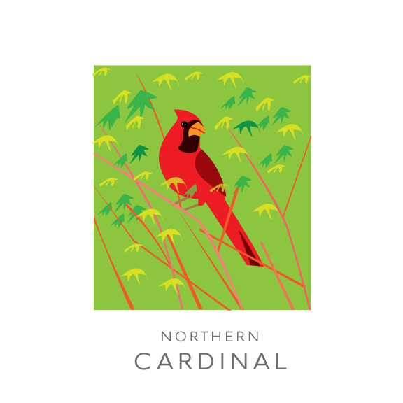
What a beautiful first day of Spring. I observed the bluebirds gathering nesting materials for their new home and cardinals perching on the Coral Bark Japanese Maple (and hanging out in the Wax Myrtles). Here's a couple of illustrations and the photos I took that inspired the drawings.
Subscribe to:
Posts (Atom)